The opioid painkiller and heroin epidemic led to a new record in drug overdose deaths in 2014 — more than 47,000 overdose deaths that year alone, and nearly two-thirds of them were linked to opioids and heroin.
But what does that death toll really look like? These maps, published by Socrata, contextualize how far and wide the opioid epidemic has spread, showing the rate of drug overdose deaths by county in 2004 and 2014:
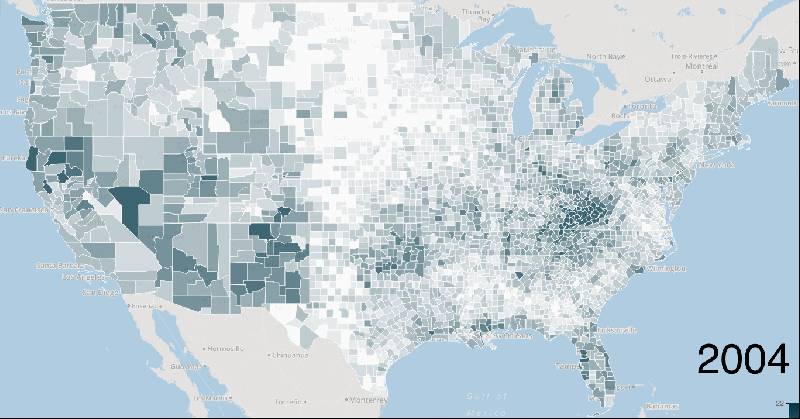
As the maps show, it’s not just that overdose deaths rose as a result of the opioid crisis; these deaths also spread to all parts of the country. The deaths are, truly, an epidemic.
How did this happen? In short, doctors resorted to opioid painkillers to help Americans deal with pain — a serious medical issue, given that chronic pain alone afflicts about 100 million Americans. But these drugs are very addictive and dangerous, so millions of people got hooked on the drugs, and tens of thousands died.
So why did doctors turn to opioids? One big reason was a concerted campaign by pharmaceutical companies that characterized these drugs as largely safe and effective — claims so misleading that Purdue Pharma, producer of OxyContin, and some of its executives would later pay hundreds of millions of dollars in fines.
Once it became clear that opioid painkillers had proliferated, government officials and doctors began pulling back on the drugs. But faced with a lack of access to treatment, many opioid users didn’t simply abandon drugs; they moved to other opioids — the cheaper and deadlier heroin and, recently, the even cheaper and deadlier fentanyl.
As a result, drug deaths have continued to rise — and governments, particularly the Obama administration, are finally trying to boost access to drug abuse treatment.